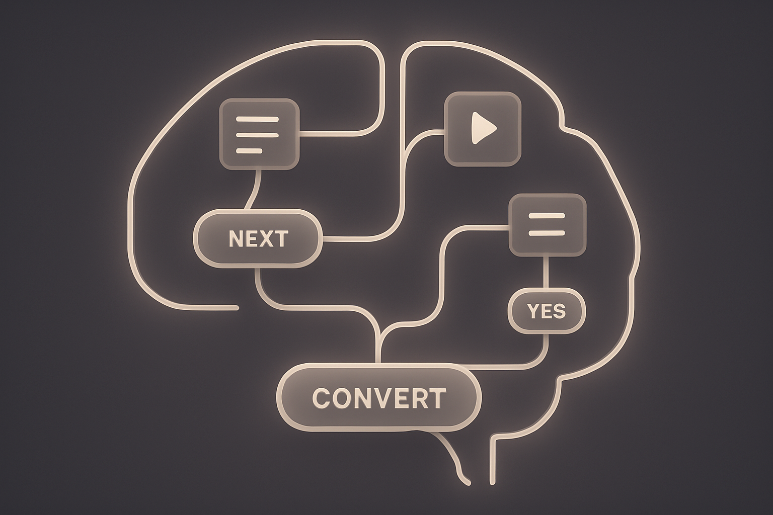
Neuro Design meets UX: How the Brain Builds Better Interfaces


If a button shows up too early, I drop off. If a form asks too much, I lose trust. If onboarding explains too much, I skip it.
That’s not laziness. It’s cognitive economy. Our brains want to save energy. Neurodesign helps us translate that into UX – using principles like:
→ Source: Bejamas, 2025 / Neuro UX Design Framework
🎯 Checkout flow for a Swiss online shop
Only two changes:
– Progress bar added
– Field order adjusted (email before name)
➡ Result: –21 % drop-offs
🧠 Why it works: clarity reduces friction. Predictability eases effort.
🧠 Mental health app landing page
Muted tones, clean sections, no stock visuals.
Key scene: realistic chat simulation instead of a generic hero.
➡ Result: +38 % engagement in the first scroll area
🧠 Source: UX Design for Mental Health, 2025
💬 Button copy in insurance onboarding
“Secure now” instead of “Complete now”
“Next step” instead of “Continue”
➡ Result: +12 % click-through rate and higher trust
🧠 Why it works: emotional triggers + semantic framing
👁️🗨️ SaaS dashboard with new information architecture
Main menu redesigned: clustered by goals, not features
Hover states simplified, microcopy clarified
➡ Result: –25 % support tickets (internal analytics)
🧠 Source: Neuro UX Case Study – Bejamas, 2025
📱 Mobile banking app with “framing overlay”
Visually encircled balance display → softly animated
No new info – just visual emphasis
➡ Result: +14 % budget tool usage
🧠 Why it works: guided attention with minimal effort
Neurodesign isn’t a trick. It forces us to design from the mind, not from the interface.
Not what looks good – but what feels clear.
And once you internalize that, every UI becomes a hypothesis.
That doesn’t make design harder.
Just more honest.
I will never send more than one email per month, I promise!